
2021
Responsive Web App
Designing web apps to support easy monitoring of surveillance devices
CLIENT
Amnimo Inc., Yokogawa
SCOPE
UX Design, Design System
ROLE & CREDITS
UX/UI Designer
Project is a team effort achieved at Minitheory
The Brief

Photo credits: UNSPLASH
How might we create monitoring apps that are user-friendly and consistent?
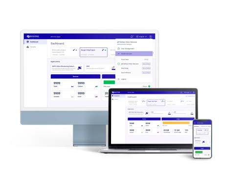
An IoT services provider, Amnimo is seeking to build products to support monitoring and managing of their various surveillance devices. We were tasked to create and unite a family of responsive web apps based off their existing wireframes and screen flow.
An open collaborative wireframing process with the Bove founders guided the development of the Bove App. The pain points of pregnant women are being examined and being translated to helpful functions and features on the app.
FIXING A UI LOOK & SYSTEM
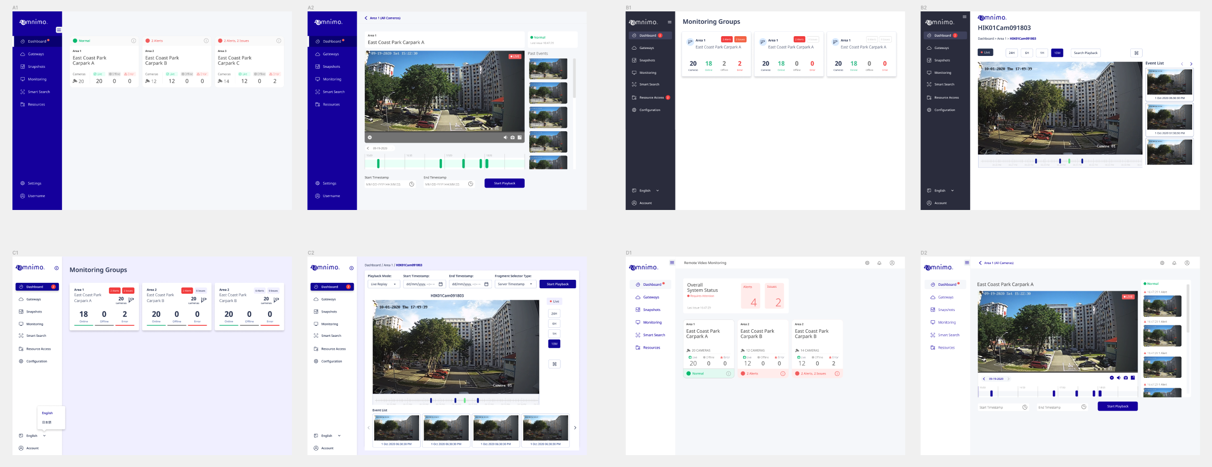
At the beginning, my teammates and I created several UI look options for the client to decide on. We did variations of the two main screens. The final UI was kept minimal and light, with white cards on a tint of the corporate colour to be easy on the eyes for long use.
UI Highlights
As this project spanned several web apps, this case study will only highlight certain parts that yielded more noteworthy & interesting design solutions.
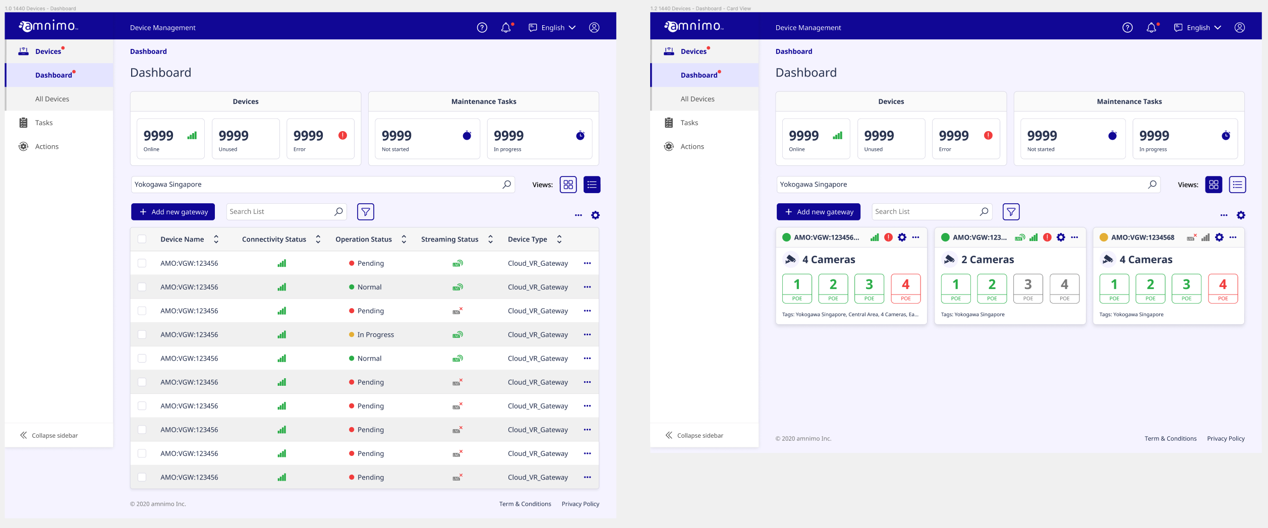
DASHBOARD FOR DEVICE MANAGEMENT APP
This dashboard page was designed to be a succinct overview of all the devices, their statuses and alerts – allowing users to see important information at a glance. It also supports two different views of devices - in tables and cards, each highlighting key info.
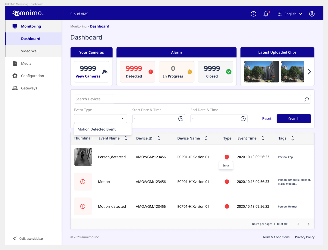
DASHBOARD FOR MONITORING
For the monitoring app, the dashboard was designed to also be concise, with colours to highlight various statuses. This intuitive design allows users to see urgent alerts and navigate quickly.
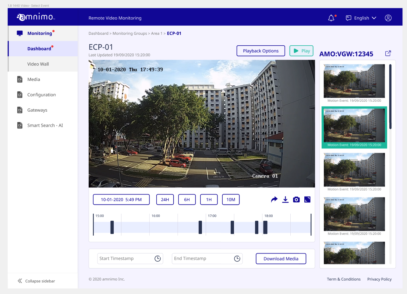
MONITORING SCREEN
This monitoring screen was designed for ease of use, with all prominent icons representing key functions for use. The time buttons allow for quick scrubbing and the timestamp quicklinks allow for fast searches.
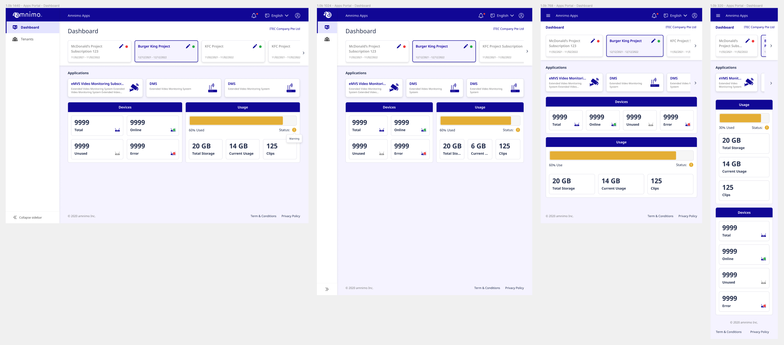
RESPONSIVE DASHBOARD FOR APPLICATION MANAGEMENT
This app houses all the other products we have designed. This dashboard screen is designed for users to navigate via their tenants on a fixed horizontal scroll at the top. The screen shows all the apps the client subscribe to and the overall statuses.
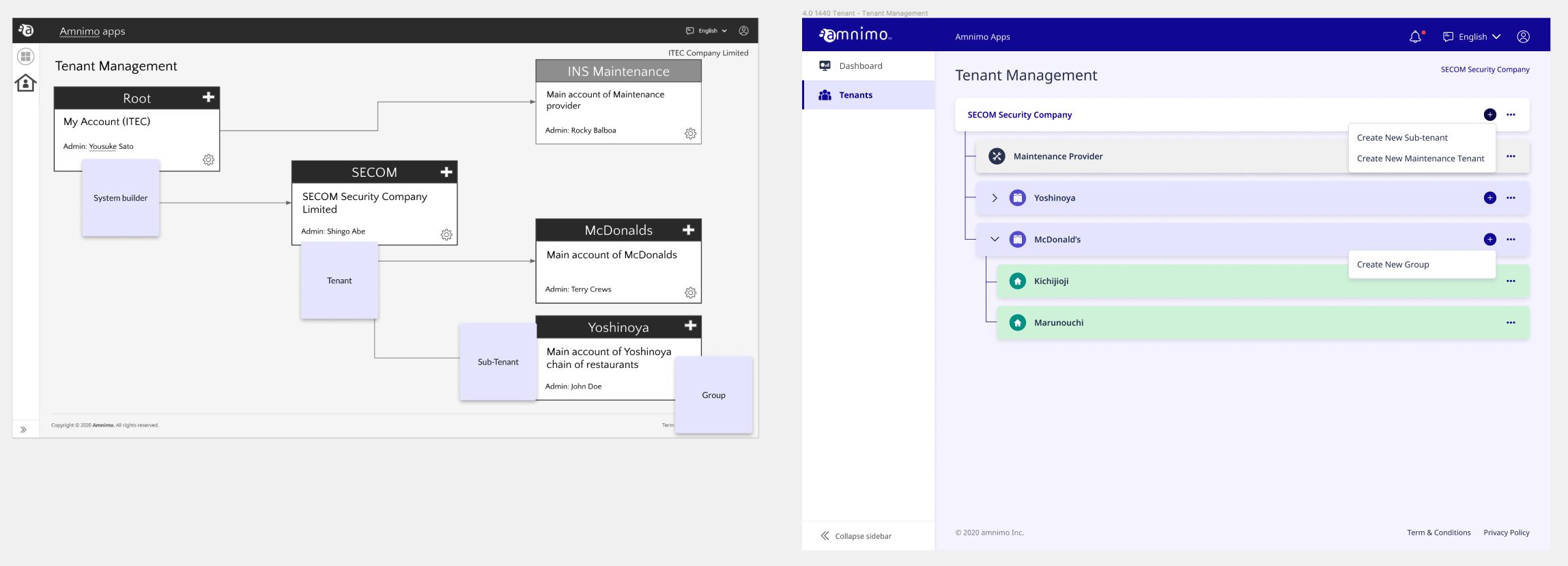
NESTED VIEW
Users needed to view tenants in hierarchial format, with the relation of the different levels in order. The functionalities of adding new tenants under a certain level and editing them were also required.
Our solution was a nested row UI that:
• could indicate hierarchy clearly through order and colours
• allows for add/edit function to be directly represented on each row
• expand/collapse function for users to decide on view and prevent being overwhelmed
• vertical scroll layout allows for adding of unlimited tenants
DESIGN SYSTEM
We created a design system that ensures consistency across all the apps we worked on, and help in fast iterations when creating screens for the new apps.

Key Learnings & Reflections
DESIGNING FOR RESPONSIVENESS
It was very challenging to design for responsiveness for this project as each screen had quite a lot of detail and required functionalities. We prioritised use on desktop and tablet, and did our best with mobile.
It was very challenging to design for responsiveness for this project as each screen had quite a lot of detail and required functionalities. We prioritised use on desktop and tablet, and did our best with mobile.
FILE "HYGIENE"
This project took over a year with multiple add-ons, so it was a good lesson to create a design system that was thorough, so the different team members could access and use relevant components across their parts without hiccup.
This project took over a year with multiple add-ons, so it was a good lesson to create a design system that was thorough, so the different team members could access and use relevant components across their parts without hiccup.
NEXT →