
2019
Concept Testing
Creating an itinerary planning app for concept testing for a major travel tech company
CLIENT
A travel tech company
[Uable to disclose company name due to NDA]
SCOPE
UX Design, Product Design, User Testing
ROLE & CREDITS
UX designer,
Project is a team effort achieved at Minitheory
The Brief
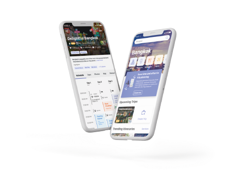
A travel company is looking to build upon its current offering – a huge database of travel recommendations built over decades. The proposed idea was an itinerary planning app that will draw upon its existing database.
We were tasked to create a prototype to bring to user testing for concept validation.
An open collaborative wireframing process with the Bove founders guided the development of the Bove App. The pain points of pregnant women are being examined and being translated to helpful functions and features on the app.
How might we make the itinerary planning process fuss-free?
Sprint-based Approach
A sprint-based approach was proposed, combining product consultancy, product design and UX design. It also promotes quick iterations, allowing us to bring multiple concepts for testing in a short time.

FOCUS OF THE SPRINT
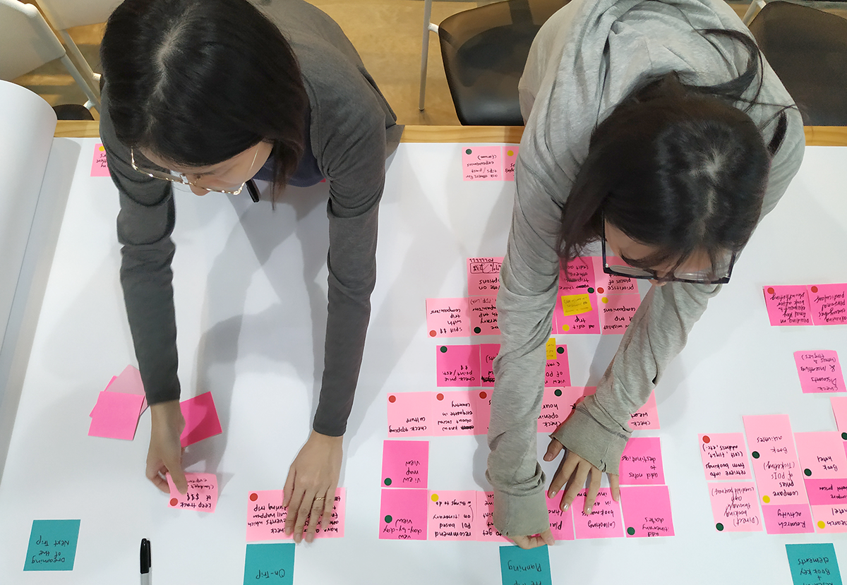
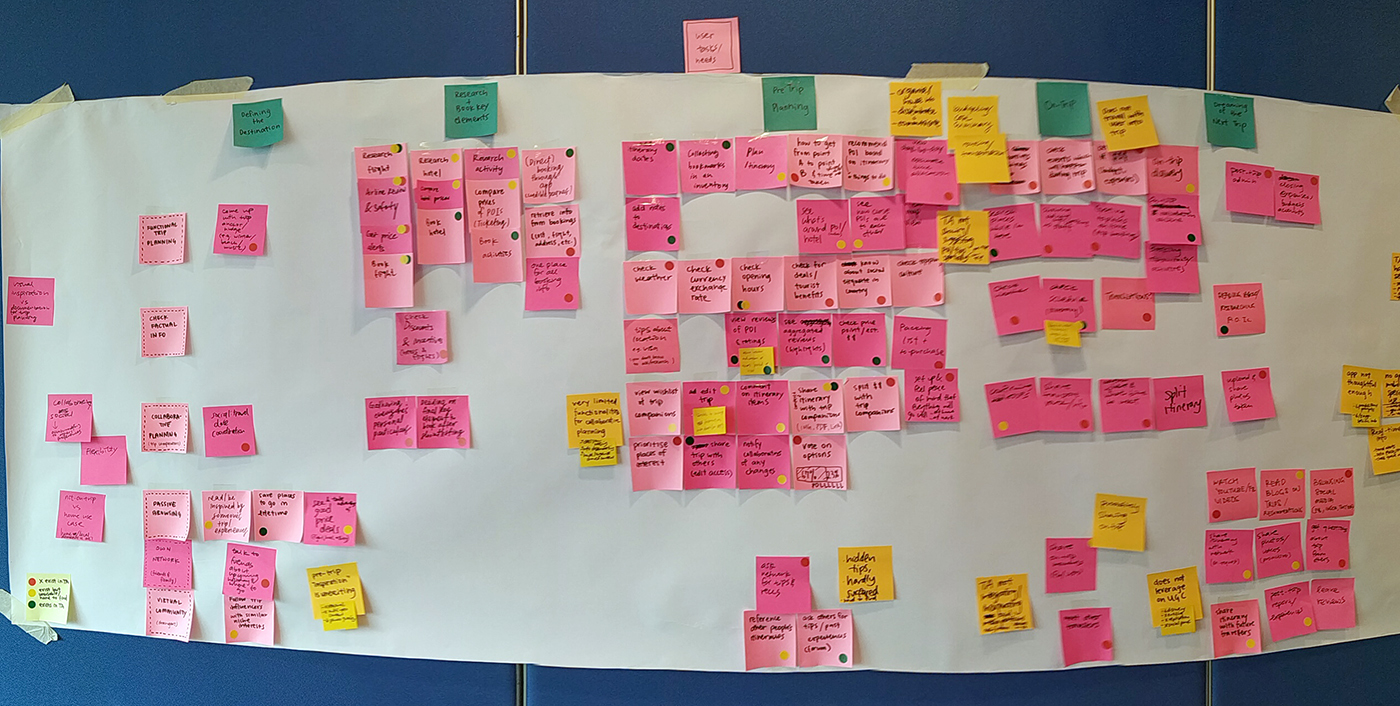
We first had a download session where we were briefed in on prior research that was done in other markets. Crunching those findings, we plotted user tasks along the travel journey, and rated the client's performance in achieving all the tasks.
A workshop was conducted to discuss main opportunity areas and develop HowMightWe statements together. Heatmap voting was used to decide on the focus areas to tackle on the sprint.
A workshop was conducted to discuss main opportunity areas and develop HowMightWe statements together. Heatmap votting was used to decide on the focus areas to tackle on the sprint.
IDEATION
Map+sketch ideation was conducted to bring several ideas to the table. Similar ideas were grouped and key screens were identified and sketched out, concluding in a low-fi prototype on paper. This was then transformed into a working prototype on figma.
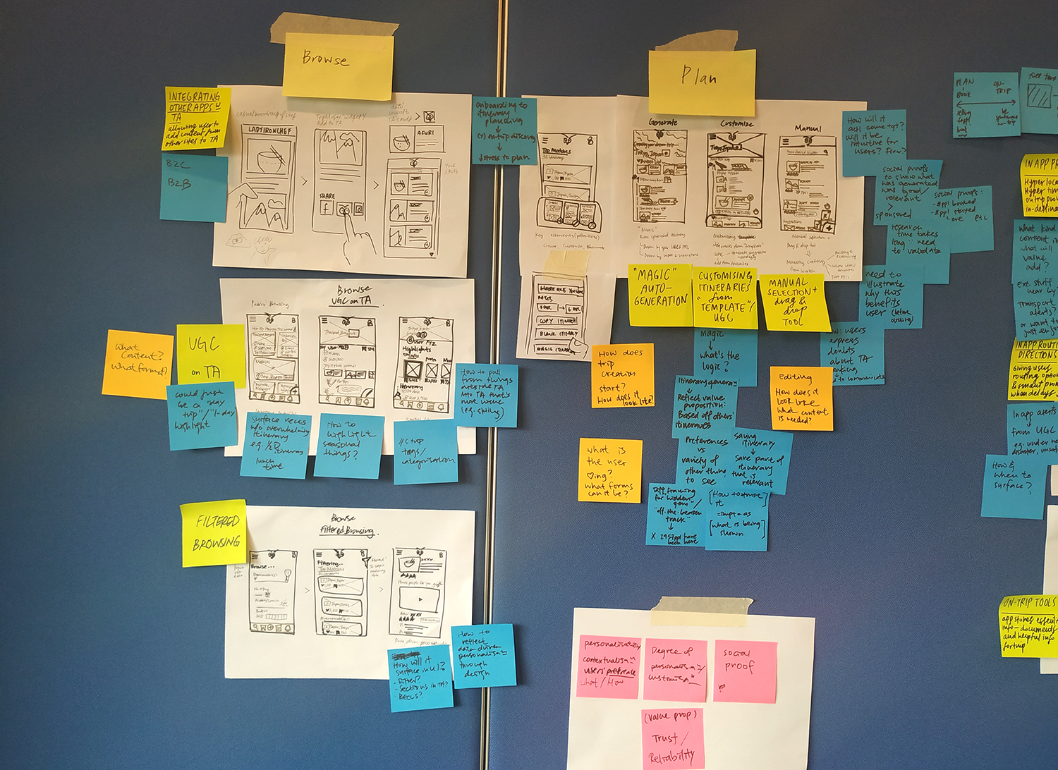
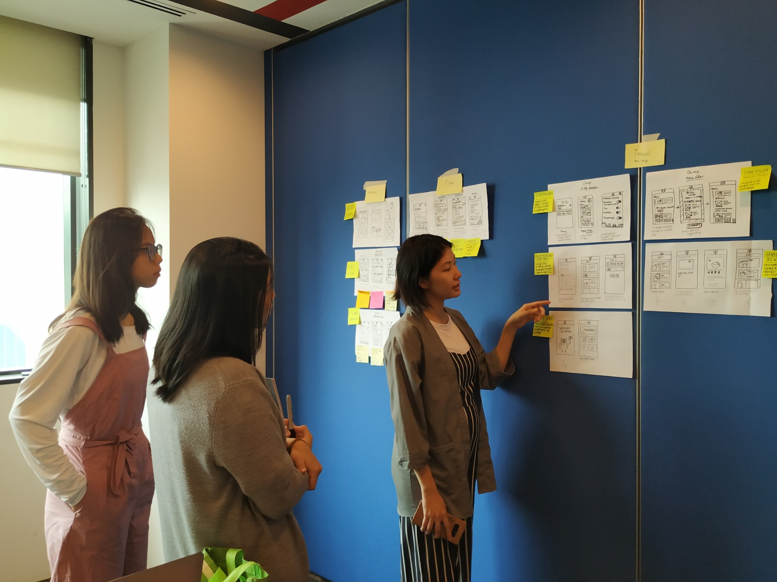
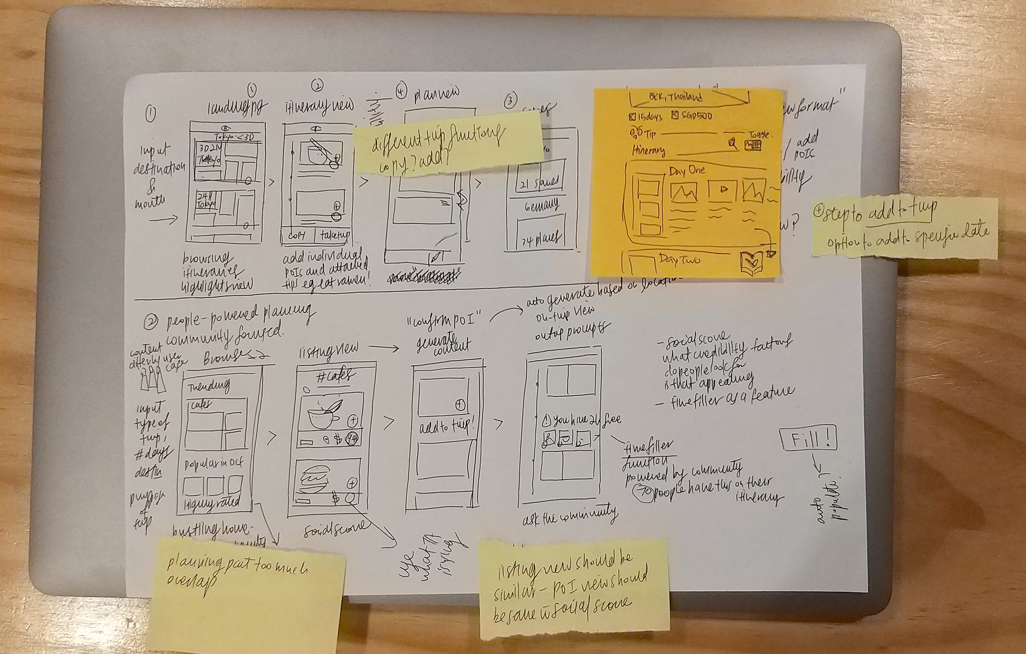
Low-fi prototype focusing on Browse and itinerary view
USER-TESTING: ROUND 1
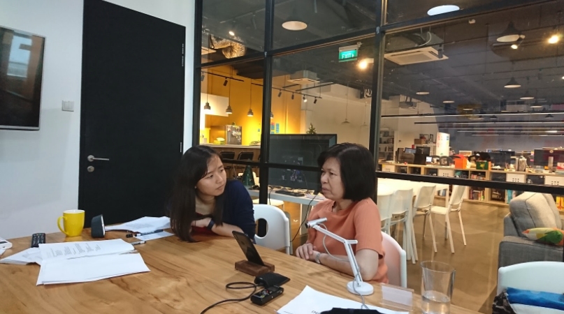
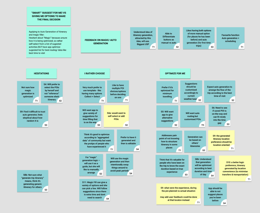
A first round of user testing was conducted with 5 users of varied nationalities and ages. A majority enjoyed the different itinerary views, evident in their immediate responses to the screens. A key feedback was regarding the level of customisation after generating the itinerary.
IMPROVING THE PROTOTYPE
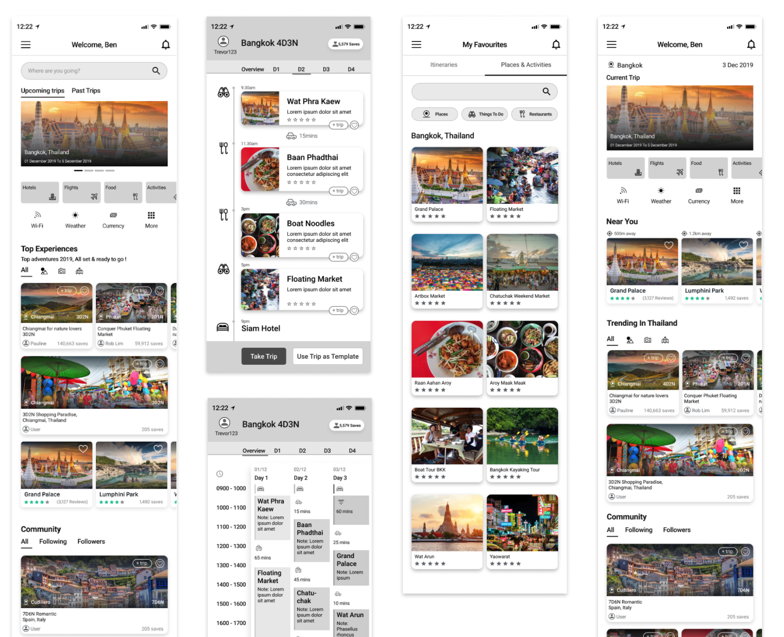
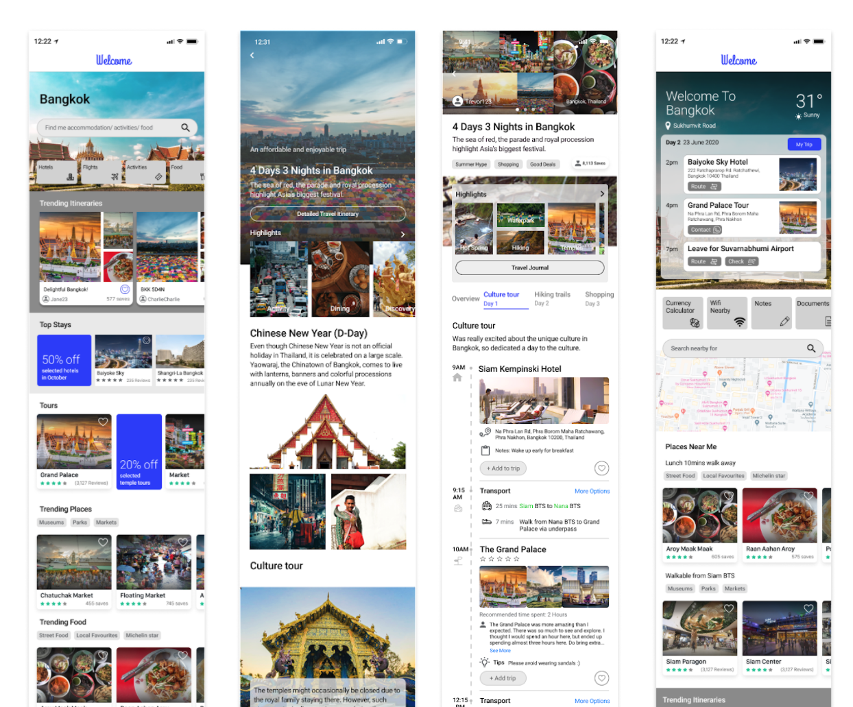
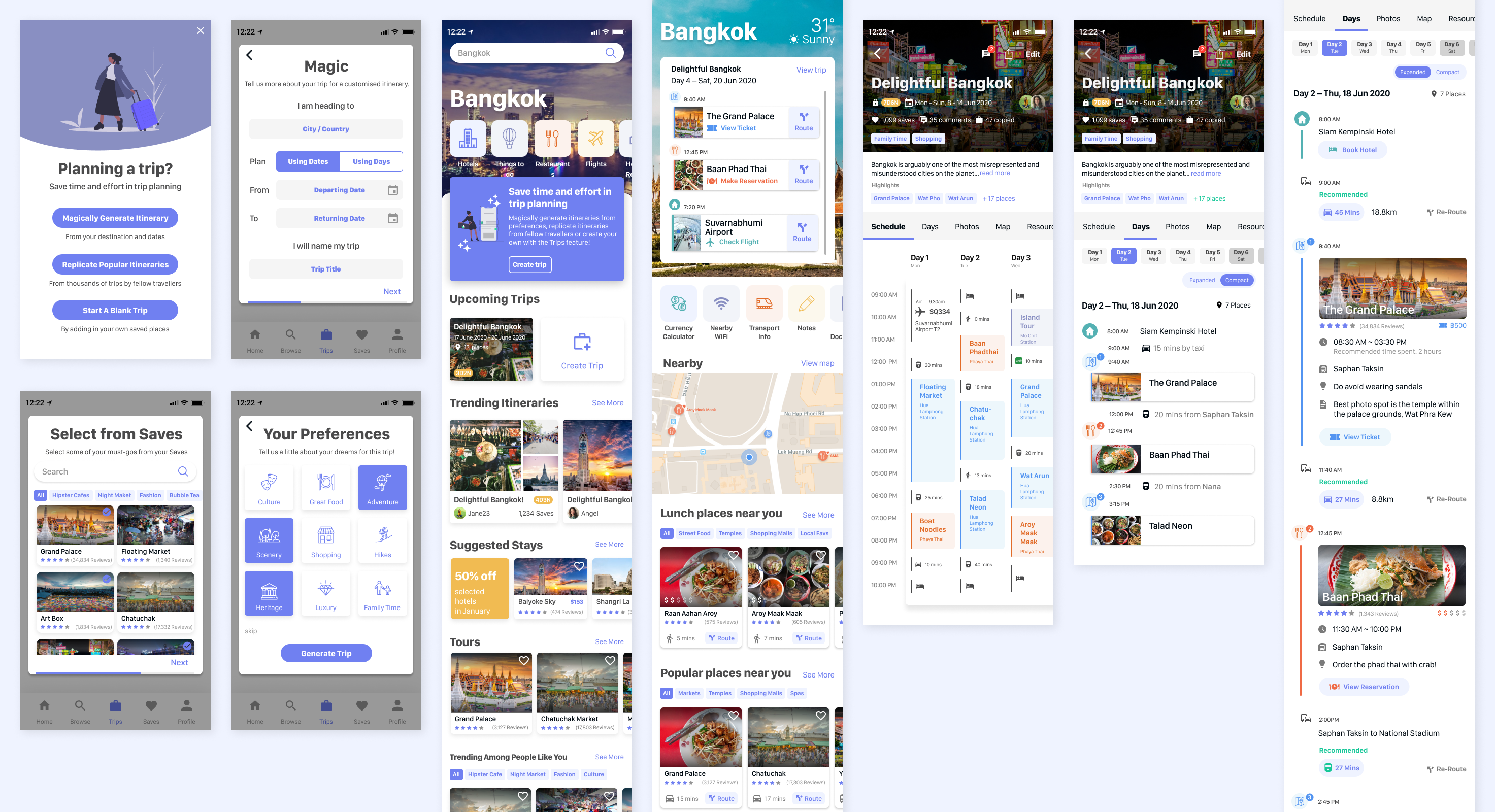
With feedback from the first user testing, we made changes to the prototype, improving on the content organisation, flexibility of customising the itinerary, as well as an on-trip homepage. We also added more social features for testing.
High(er)-fi prototype focusing on flexibility in customising the itinerary
USER-TESTING: ROUND 2
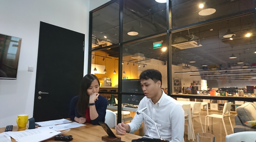
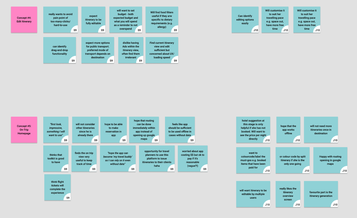
A second round of testing was conducted, with similar demographic of testers.
REFINING THE PROTOTYPE
The prototype was further refined, including some features and views that were discussed previously.
FINAL PROTOTYPE
This final prototype, alongside a Sprint Report detailing the process and test results analysis [cannot be disclosed] were delivered at the end of the project.
Key Learnings & Reflections
SPRINTING TOO SLOWLY?
Towards the end of the project, we realised that the client had a clear idea of what the product should be and features to include. Going straight into wireframing and optimising the prototype for testing those features might have yielded more detailed insights than embarking on the design sprint.
Towards the end of the project, we realised that the client had a clear idea of what the product should be and features to include. Going straight into wireframing and optimising the prototype for testing those features might have yielded more detailed insights than embarking on the design sprint.
FAIL FAST, FIX QUICKLY
The nature of the sprint allowed us to present many ideas quickly in low-fi formats and concentrate on what was sticking. There were misaligned expectations on how finished the concept screens needed to be to bring to testing, and this could be better communicated at the beginning of the project.
The nature of the sprint allowed us to present many ideas quickly in low-fi formats and concentrate on what was sticking. There were misaligned expectations on how finished the concept screens needed to be to bring to testing, and this could be better communicated at the beginning of the project.
OPTIMISING WORKFLOW
Overall, the team (new to working together) had many learnings of optimising workflow with tools like digital post-its for discussion and documentation, setting up of figma file to allow for faster iterations – that can all be brought to future projects.
Overall, the team (new to working together) had many learnings of optimising workflow with tools like digital post-its for discussion and documentation, setting up of figma file to allow for faster iterations – that can all be brought to future projects.
← PREV
NEXT →