
2021
Web App
Creating a product to aid in career guidance for people interested in the tech industry
CLIENT
Alphacamp, Taiwan
SCOPE
Product Design, UX Design, UI Design, User Testing
ROLE & CREDITS
UX & UI designer
Project is a team effort achieved at Minitheory
In Development
NOTE: Due to NDA, this case study is written as a broad overview with intentionally low-res imagery. Do reach out to find out more.

The Brief
Alphacamp is a niche technology course provider seeking to deliver tangible outcome for students. They have observed an increased dropout rate of recent, where students do not complete their courses despite having paid for them.
Alphacamp believes that by having greater clarity in the career paths that students will be more focused and finish the courses. As such, we were tasked to create a digital solution for greater student retention.
An open collaborative wireframing process with the Bove founders guided the development of the Bove App. The pain points of pregnant women are being examined and being translated to helpful functions and features on the app.
How might we help students identify their goals?
How might we increase student retention in Alphacamp?
Sprint-based Approach
A sprint-based approach was proposed, combining product consultancy, product design and UX design. It also promotes quick iterations, allowing us to bring multiple concepts for testing in a short time.
Due to Covid-19 and travel bans, this project was conducted remotely across Singapore & Taiwan.
AFFINITY MAPPING
Kicking off the design sprint, we tried to define the sprint focus. While listening to the founder's interview, all sprint participants came up with HowMightWe statements. We then did affinity mapping, linking similar ideas and grouping them. A heatmap voting was conducted to determine the most prominent challenge to tackle.
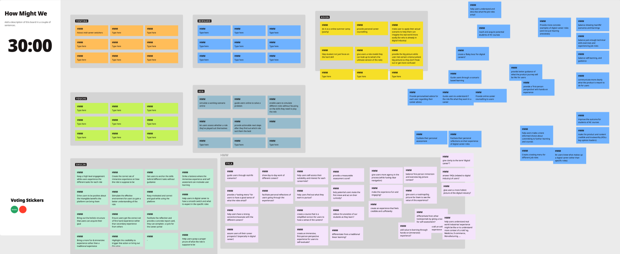
HOWMIGHTWE stATEMENTS
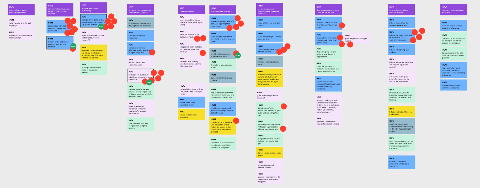
Affinity Mapping
JOURNEY MAPPING
Through a lively conversation, we plotted a flowchart showing how users will interact with our product. The goal of this product is determined as assessing the student's interest and suitability for different tech roles.
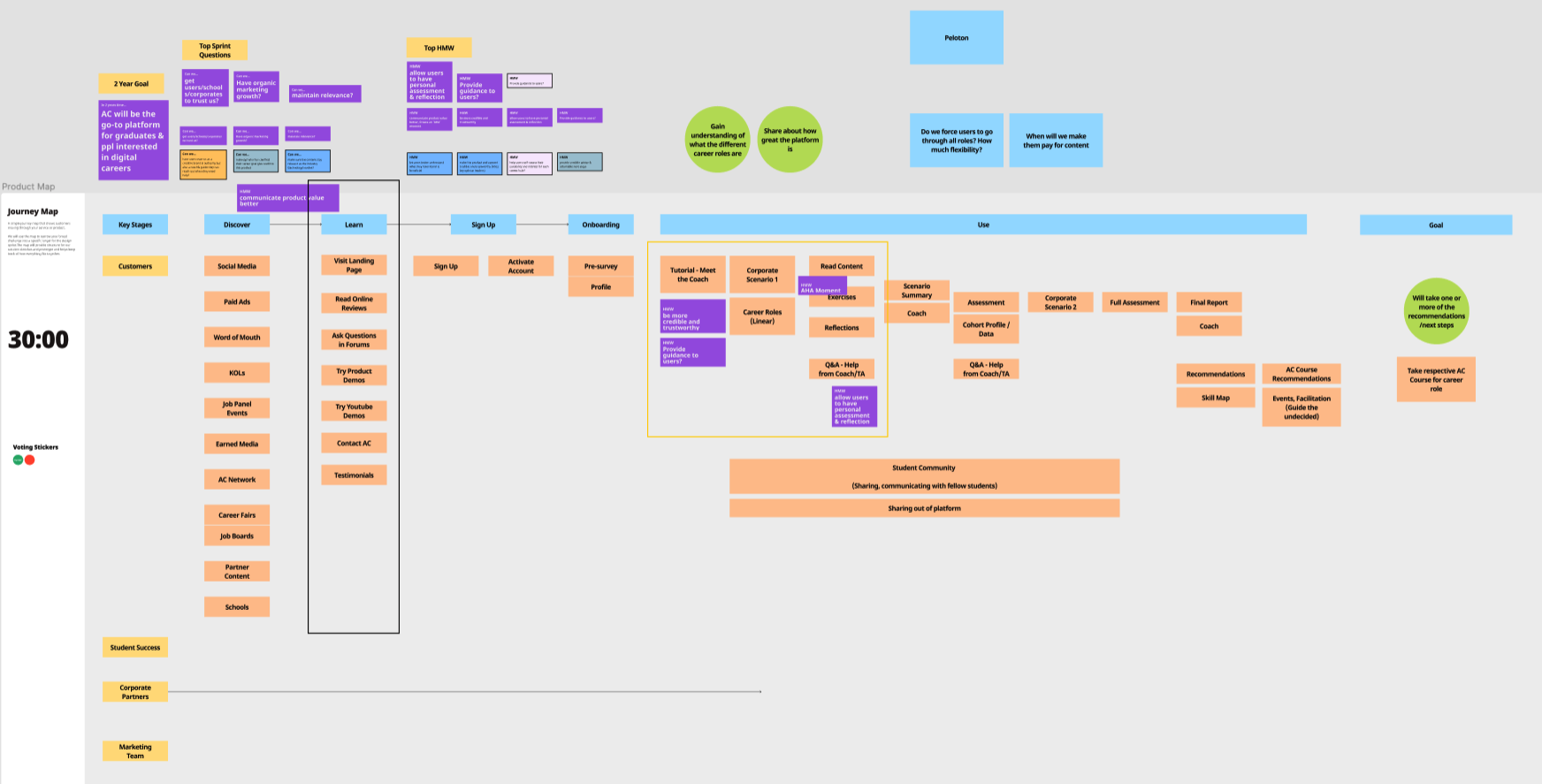
journey map
LIGHTNING DEMOS & IDEATION
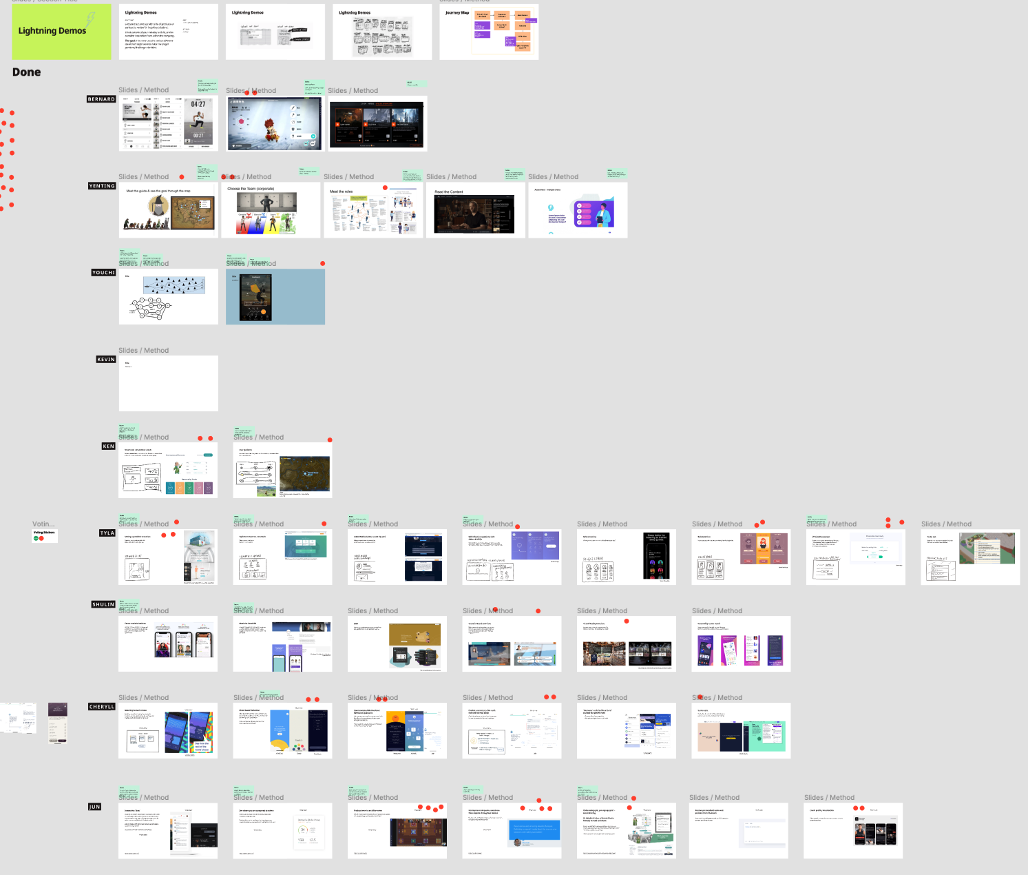
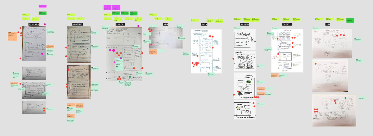
All sprint participants were tasked to prepare and present references that inspire them. We then created sketches based on those ideas and voted to highlight the most intriguing ones relevant to our product.
USER TEST FLOW
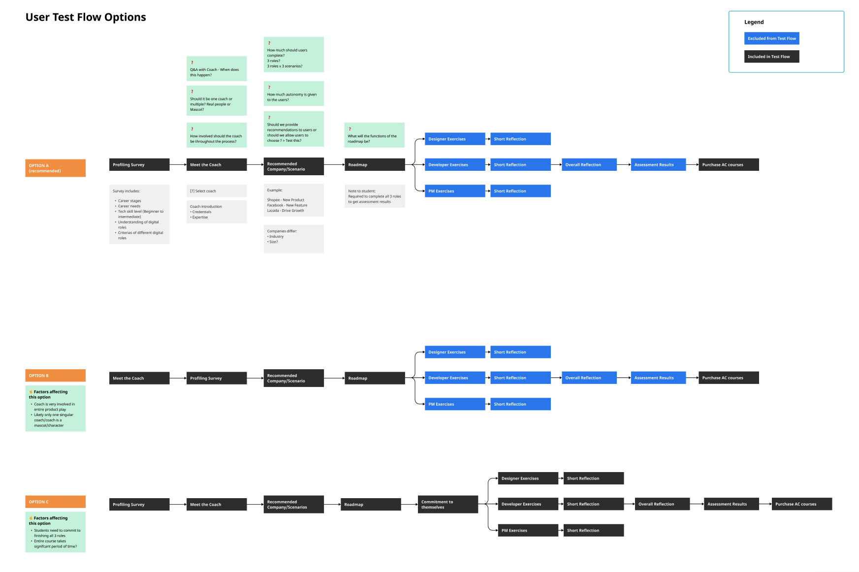
A user test flow was decided upon the review of workable ideas, stringing together ideas from the sprint into a flow for us to build the product upon. A working prototype (created in Protopie) was completed for the user testing.

USER TESTING (CONDUCTED IN TAIWAN)
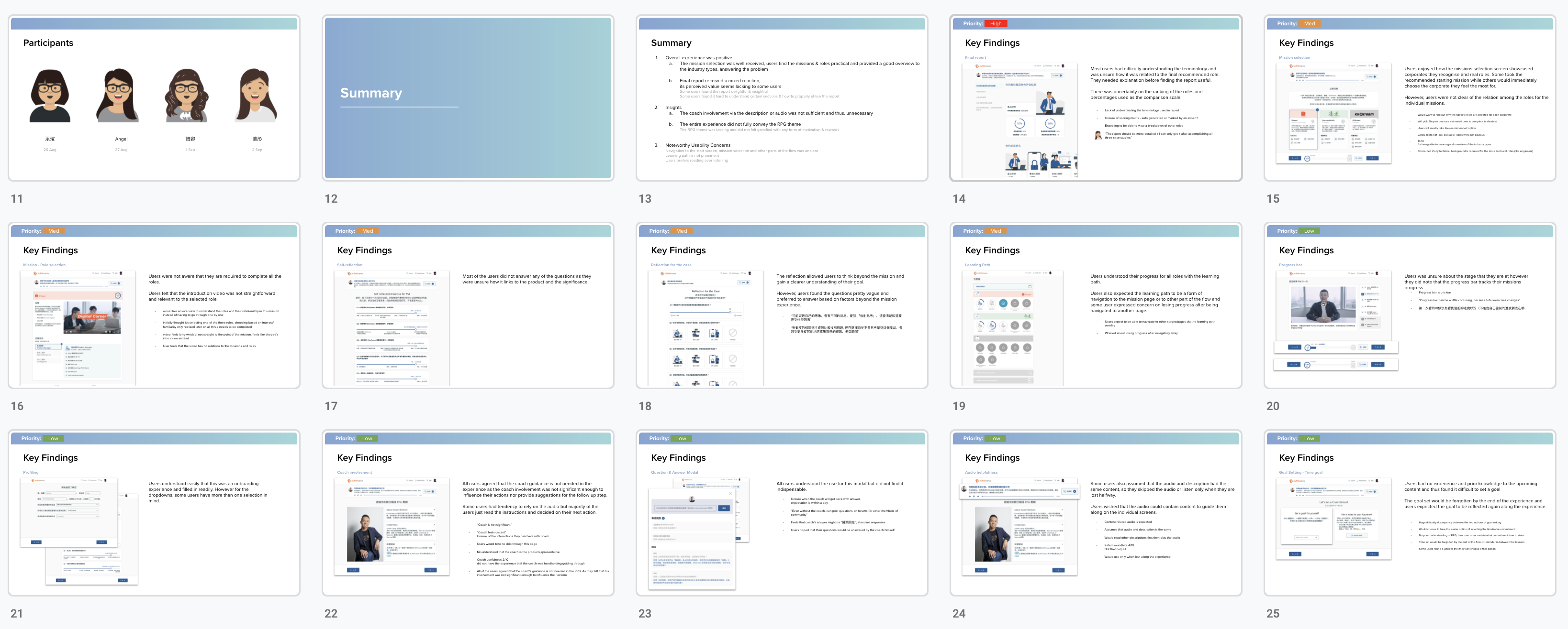
User testing was conducted by the client, with guidance from us. Following four interviews, we collected the key findings and analysed them, compiling the key insights in a report organised in priority of high to low severity.
NOTEWORTHY UI ELEMENTS
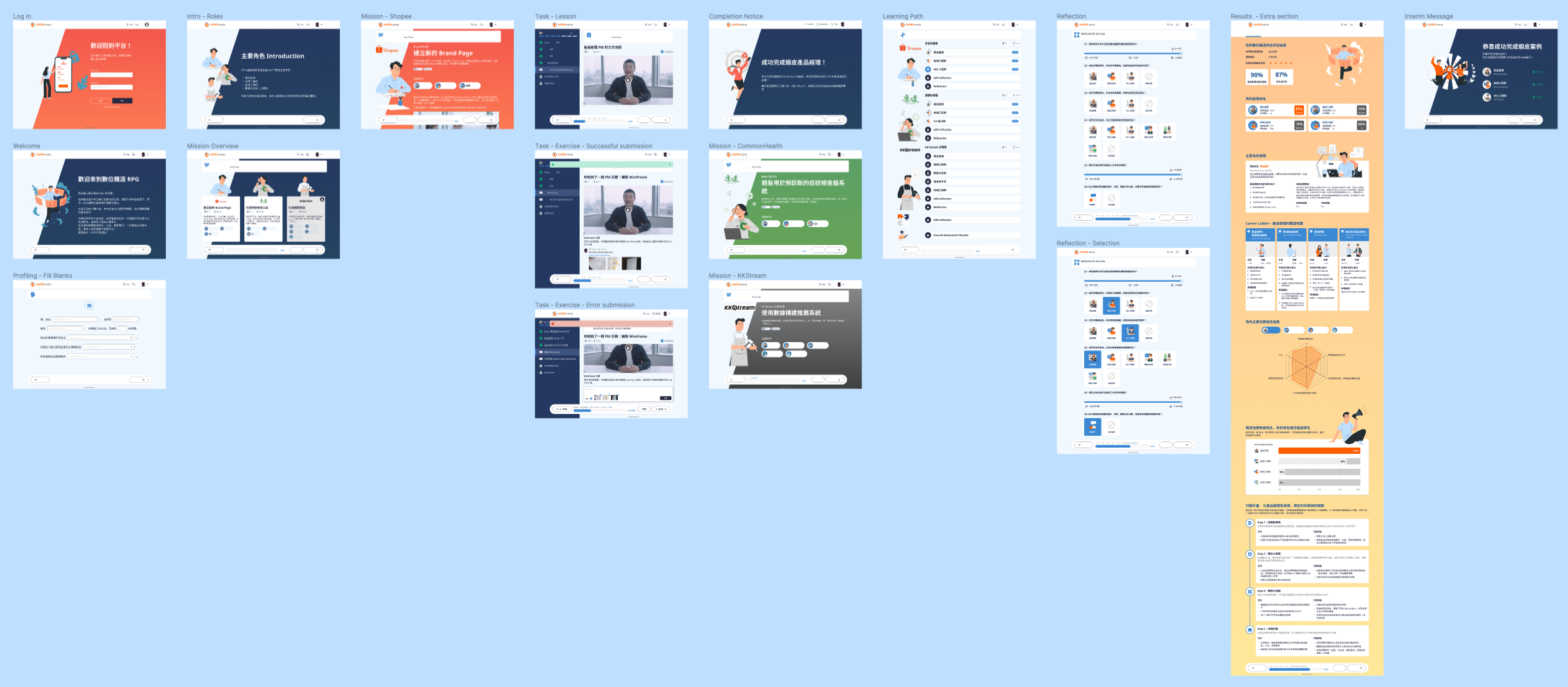
The entire protoype was refined and brought to development.
The following are some noteworthy revisions for improved user experience based on feedback from testing and client's input.
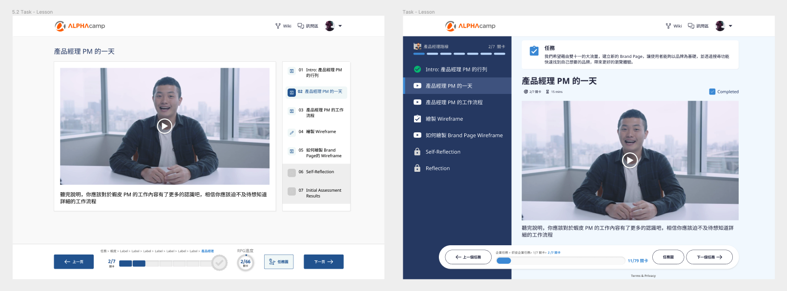
It was challenging designing UI to showcase individual module progress as well as the overall progress on the experience. We kept the sticky progress bar at the bottom with quick links and overall progess, and added a bar progress on the playlist.
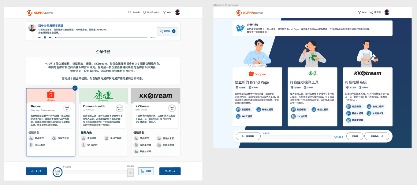
The testing revealed that users found the audio clips from the coach unnecessary and disruptive, contrary to what the client thought would inspire and assure. In its place, we use a instructional descriptor at the top of every page.
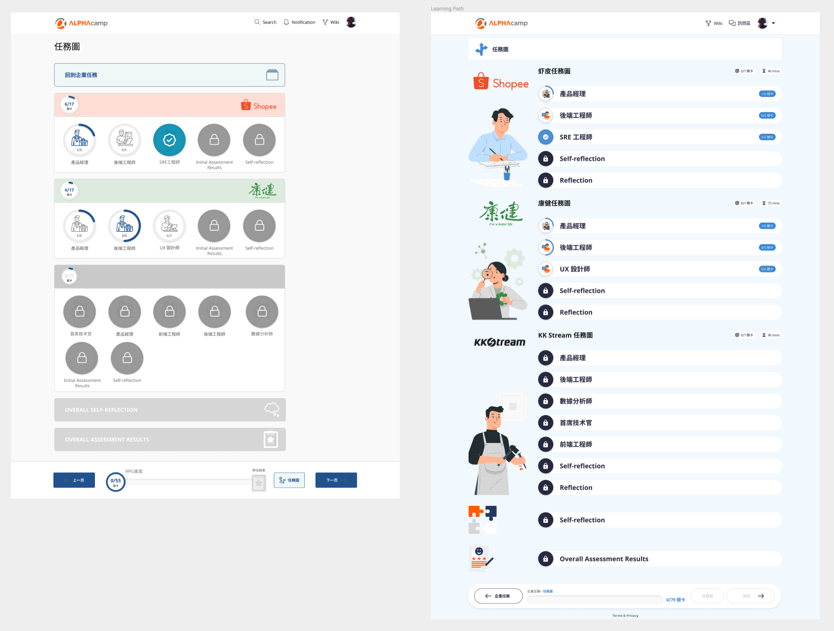
The learning path was designed initially as a modal to allow for quick access to the different exercises. The testing revealed that it could be confusing. The revised learning path reinforces that the different exercises should be tackled in a linear fashion.
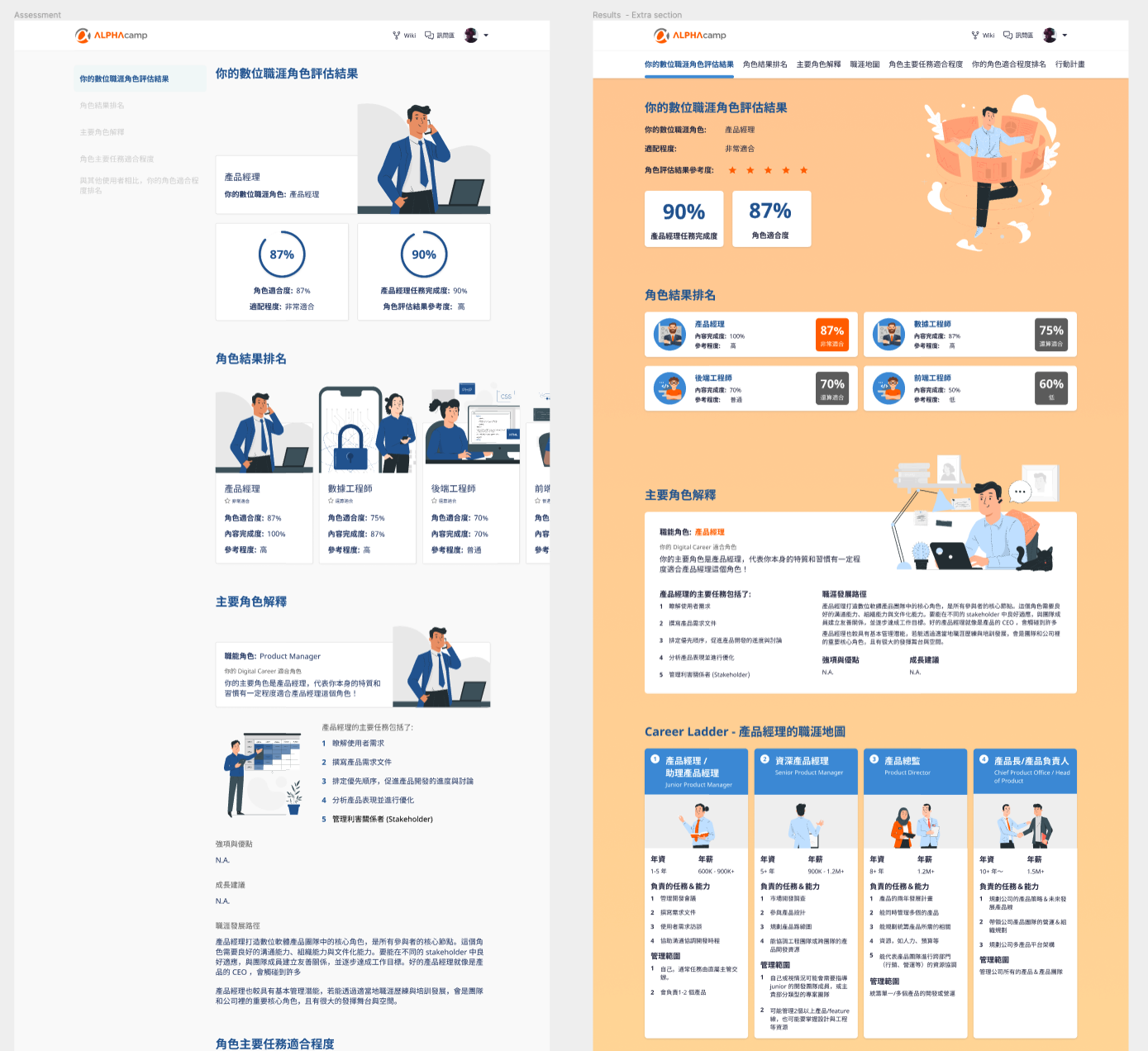
Users found the results at the end to be too confusing. We reorganised and added a top navigation tab to allow for a better reading experience.
FINAL PROTOTYPE
Key Learnings & Reflections
SPRINTING TOGETHER REMOTELY
Truly grateful for the collaborative tools we have today. Figma, Figjam, Google Sheets and Zoom made conducting a remote sprint not only possible but effective.
Truly grateful for the collaborative tools we have today. Figma, Figjam, Google Sheets and Zoom made conducting a remote sprint not only possible but effective.
MITIGATING CULTURAL BARRIERS WITH TESTING
We were unsure of certain ideas and features in the beginning but did think that it could be a cultural issue that we did not understand. Interestingly, testing results convinced us and the client to rethink the feature.
We were unsure of certain ideas and features in the beginning but did think that it could be a cultural issue that we did not understand. Interestingly, testing results convinced us and the client to rethink the feature.
WORKING WITH LIMITATIONS
While exploring the form of this digital product, we also had to integrate existing media that the client already had – which limited the ideas to a certain extend. We tried to compensate with more gamification elements to make the experience more immersive.
Overall, the team (new to working together) had many learnings of optimising workflow with tools like digital post-its for discussion and documentation, setting up of figma file to allow for faster iterations – that can all be brought to future projects.
← PREV
NEXT →