
2021
Microsite
Creating an engaging virtual openhouse experience that tells a story
CLIENT
PCF Sparkletots
SCOPE
UX Design, UI Design, Illustration
ROLE & CREDITS
UX/UI Designer, Illustrator
Project is a team effort achieved at Minitheory
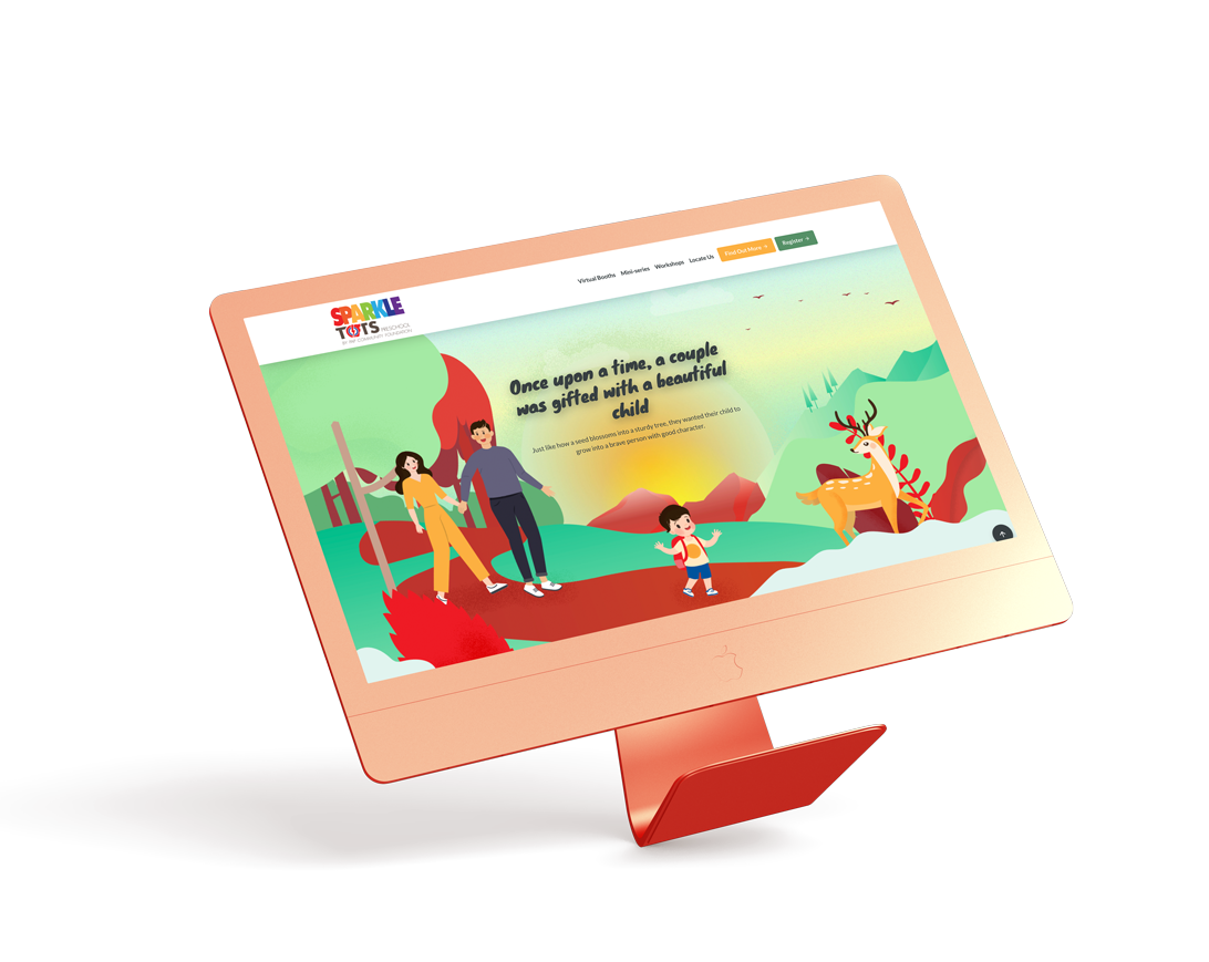
The Brief
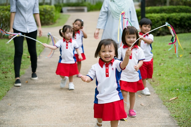
Photo credits: PCF Sparkletots
How might we make the virtual openouse engaging?
A local childcare operator, PCF Sparkletots, was looking to create an engaging openhouse in preparation for enrolment 2021. Due to Covid-19 safety measures, the openhouse had to be conducted virtually, in the format of a microsite. We were tasked to create the site from scratch, based on the given theme of "Enchanted Forest".
An open collaborative wireframing process with the Bove founders guided the development of the Bove App. The pain points of pregnant women are being examined and being translated to helpful functions and features on the app.
EXPLORING ART DIRECTION
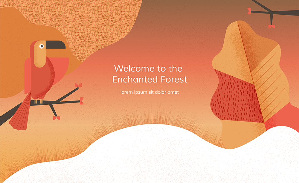
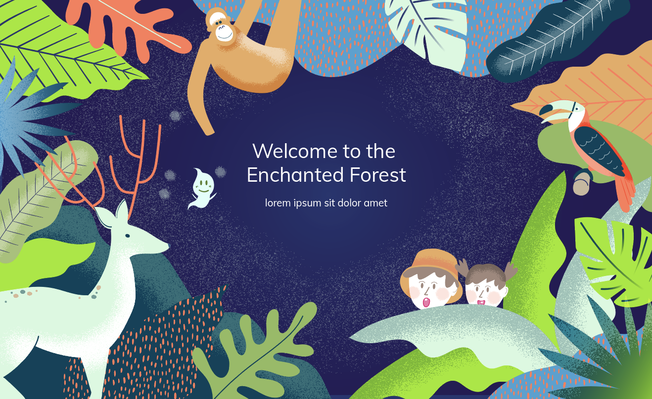
Based on the theme of "An Enchanted Forest", we explored various options of illustration styles in varying levels of fantasy and stylisation.
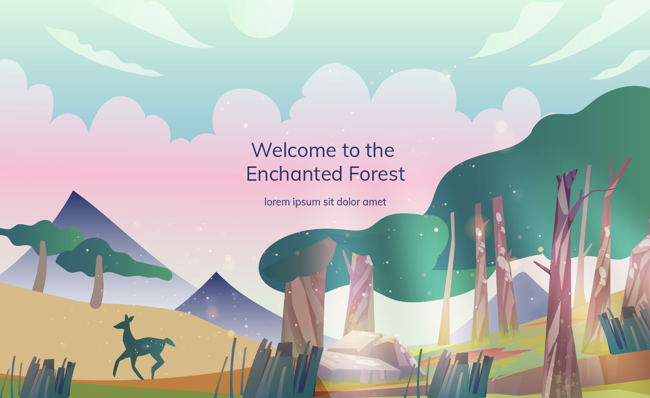
DECIDING ON THE ART DIRECTION
After rounds of iterating and discussions with the client, we were down to these two main stylistic directions.
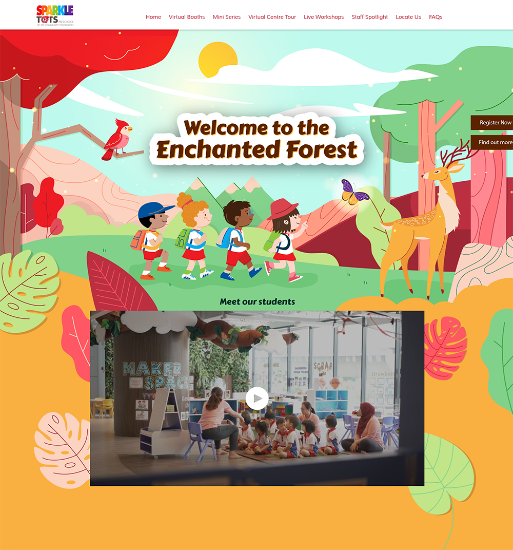
Option 1: Illustration style is simple with accented line strokes, in a natural colour palette with the idea of transiting through the rainbow spectrum of the client's logo down the page
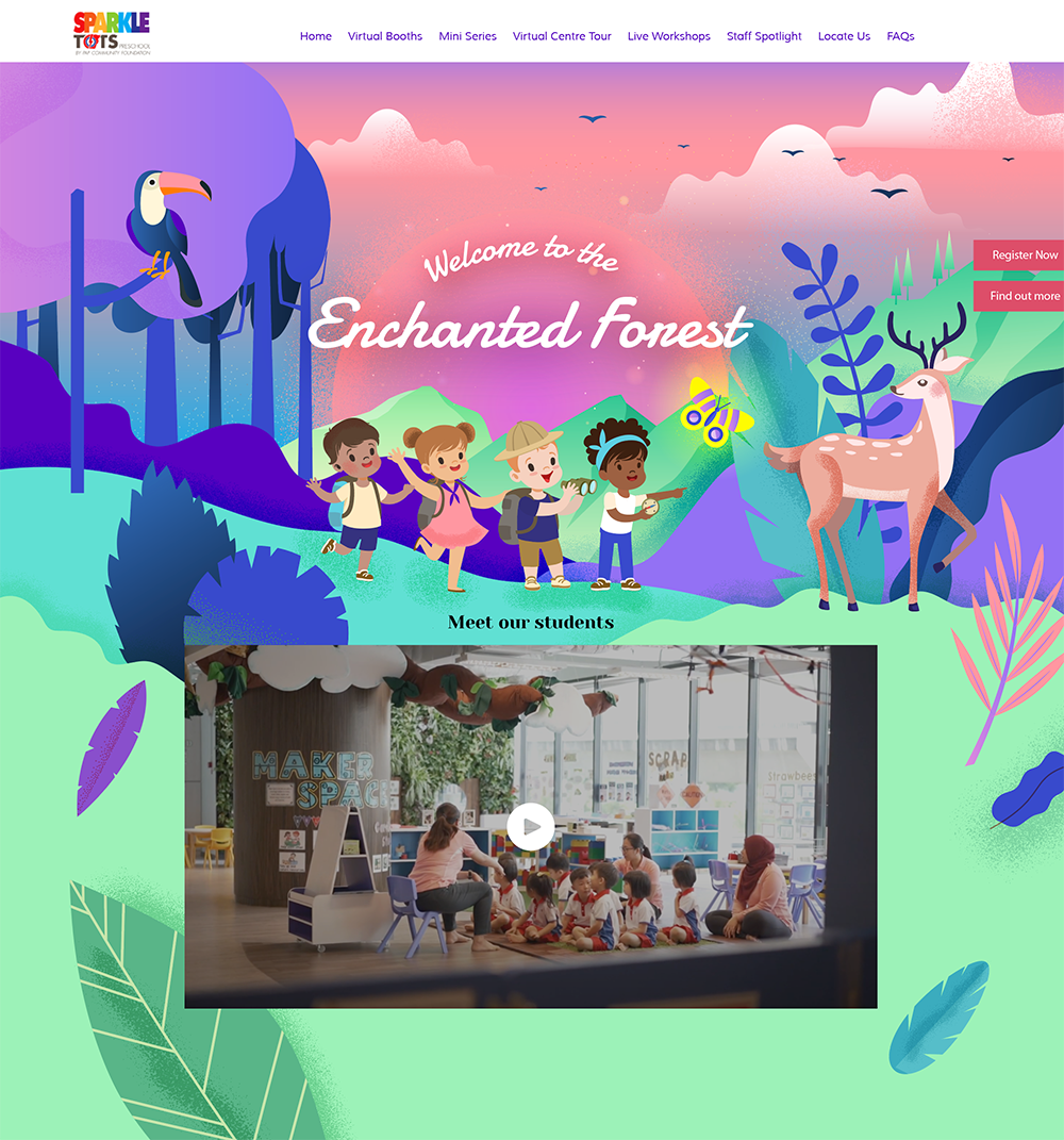
Option 2 uses a more fantastical colour scheme, with a noise grainy texture that brings more depth to the composition
INFORMATION ORGANISATION & WIREFRAME
Meanwhile, we also worked out the organisation of the different information required to be displayed on the site and the illustration ideas on a wireframe sketch.
Illustrations were then created based on the confirmed wireframe, with the illustration style of option 2, in option 1's colour scheme.
wireframe

wireframe

final design

UI STYLING
We also created the UI style guide based on the confirmed colour palette and look, creating an overall cohesive look.
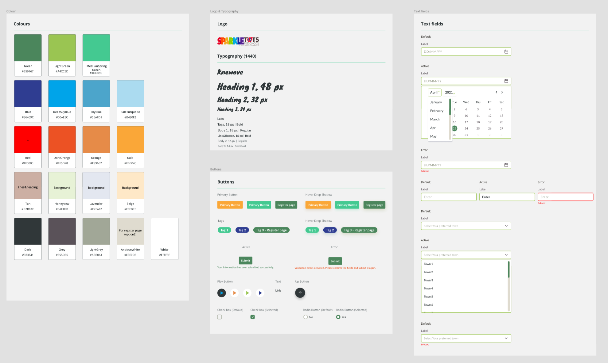
DESIGNING, ILLUSTRATING AND CREATING THE WORLD
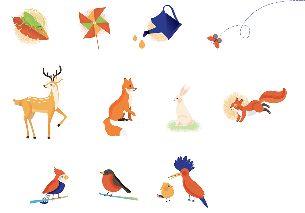
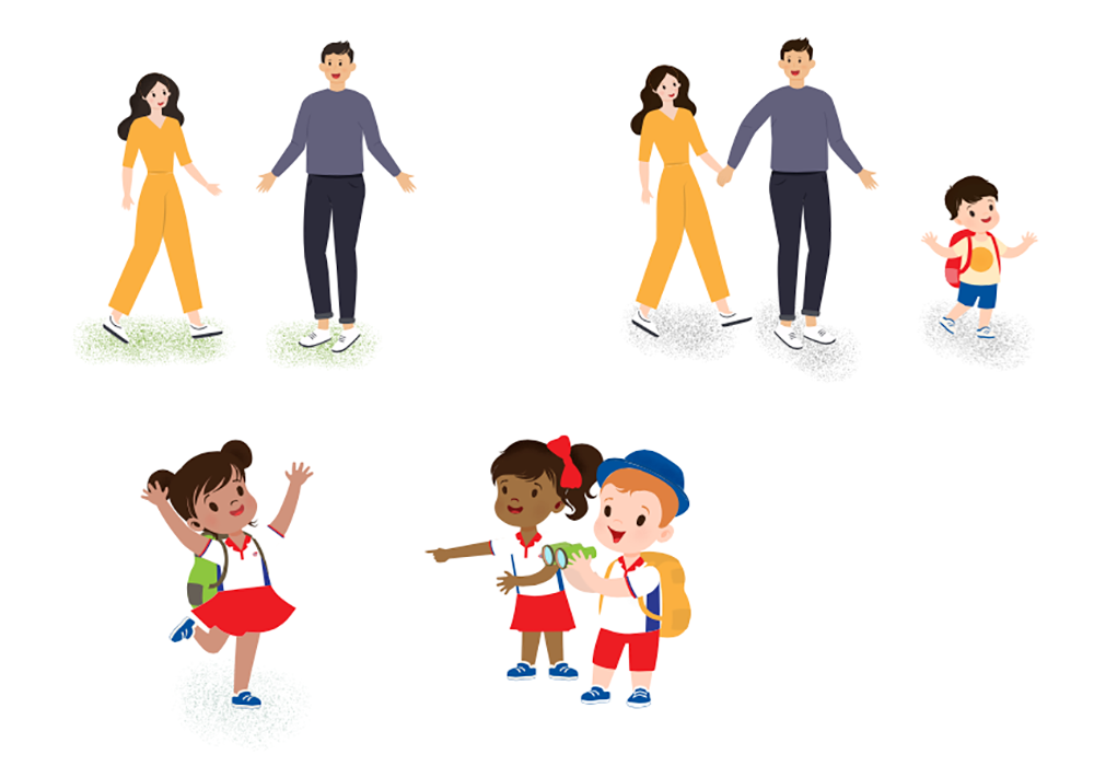
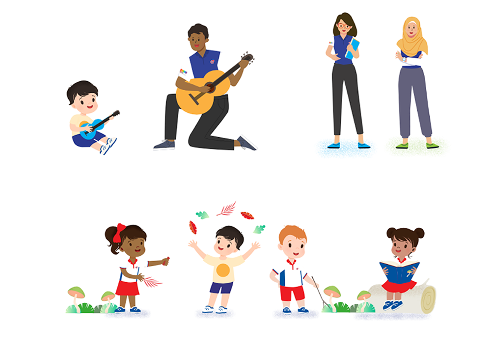
Many animals of the forest, and Sparkletots students were illustrated to accompany the overarching storyline, and scroll transitions were considered to bring visual interest and delight to the overall experience.
The website in action
DESIGNING FOR RESPONSIVENESS
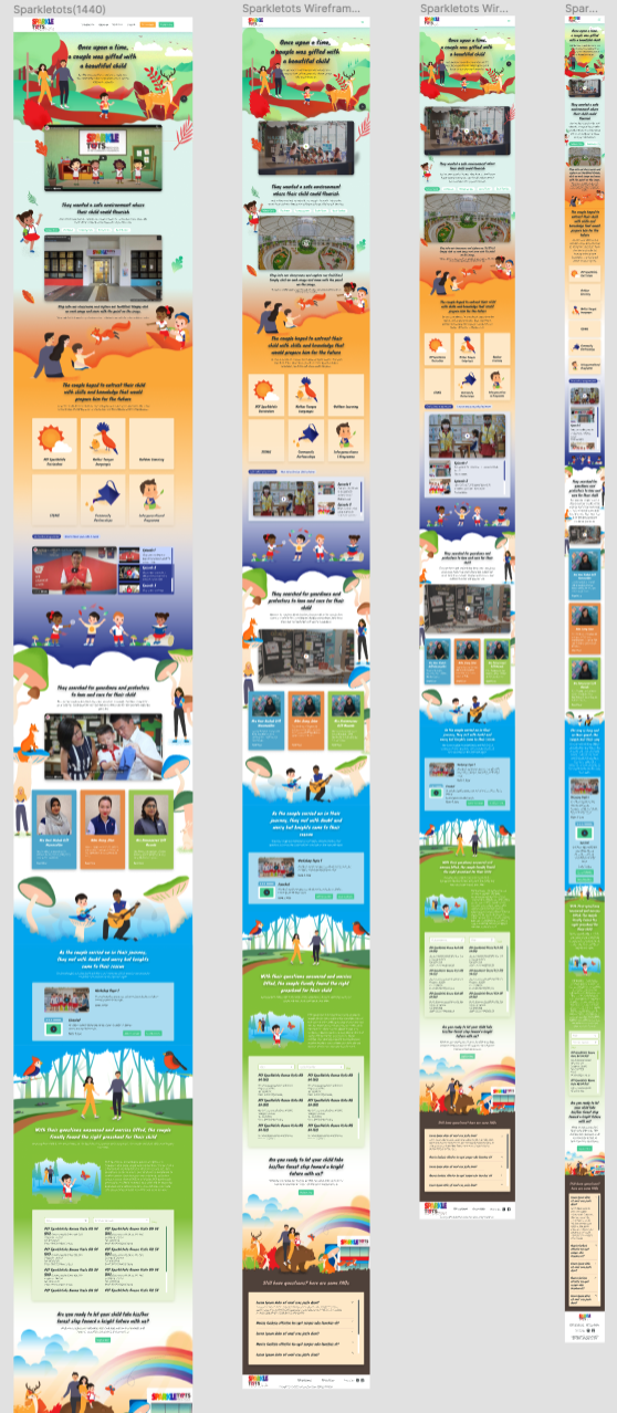
While the desktop version is progressing, we also worked on the tablet and mobile breakpoints to ensure that the site works well on different screen sizes.
Key Learnings & Reflections
MAKING THE BEST OF THE CONTENT
The content and copy were non-negotiable, so we had to do our best to work with how the storyline is being sectioned, and base the illustrations closely yet intepreting with more whimsical inspiration to create an experience that is more delightful.
The content and copy were non-negotiable, so we had to do our best to work with how the storyline is being sectioned, and base the illustrations closely yet intepreting with more whimsical inspiration to create an experience that is more delightful.
RESPONSIVE CHALLENGES
As the microsite contained quite a number of illustrations, ensuring that the site works well on all devices was quite challenging. We worked closely with the developers, and did some trial and error over the different breakpoints to ensure the site looks good on different screen sizes.
As the microsite contained quite a number of illustrations, ensuring that the site works well on all devices was quite challenging. We worked closely with the developers, and did some trial and error over the different breakpoints to ensure the site looks good on different screen sizes.
← PREV
NEXT →