2024
Brand Identity
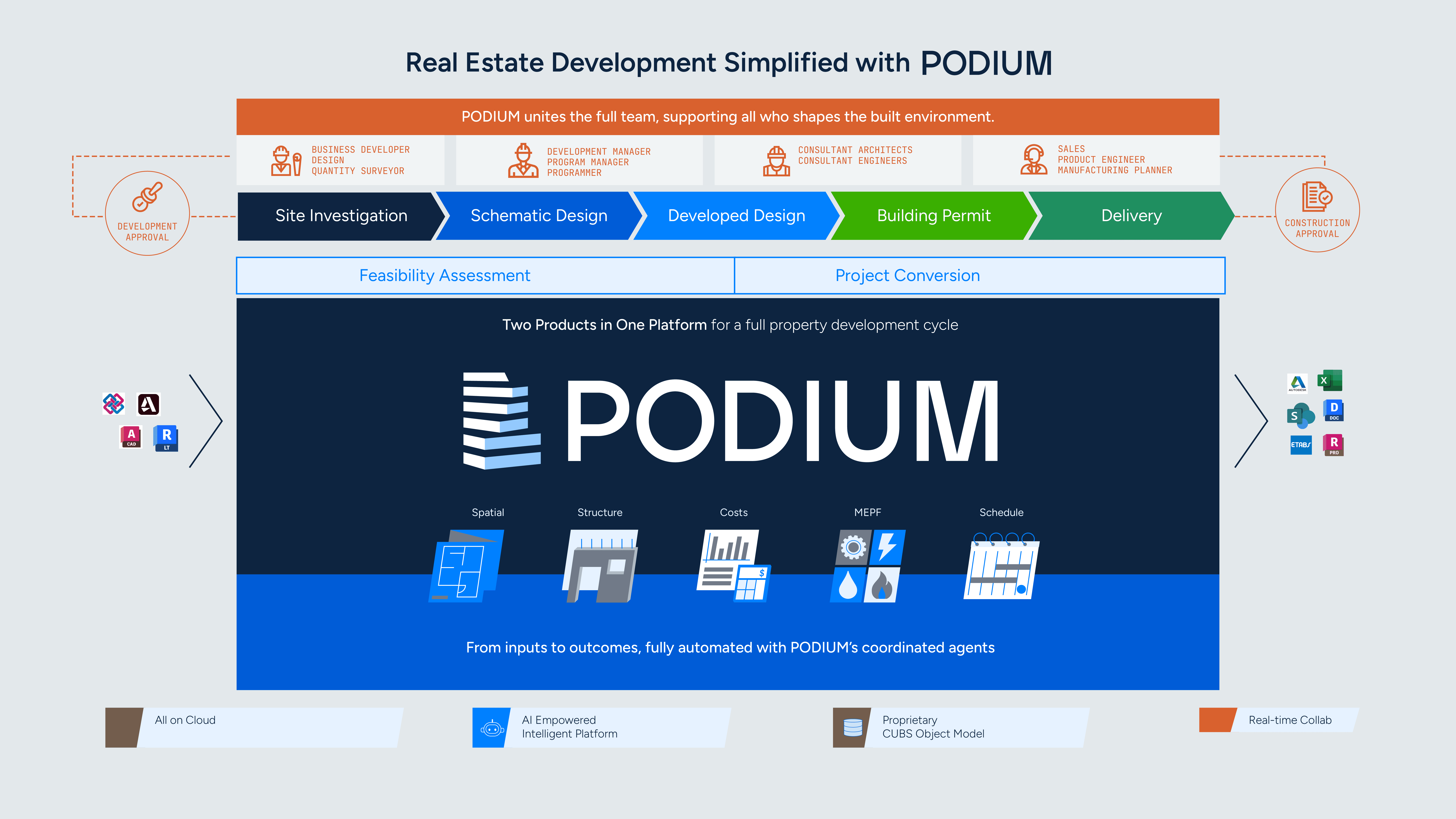
Developing a brand identity to anchor a startup post spin-off
CLIENT
Podium
SCOPE
Brand identity, Collateral design, Illustration
ROLE
Brand designer
(for this project, but usually the product designer)

Overview

LAUNCHING AT TOWN HALL
For strategic reasons, Podium has spun out of Lendlease Digital as an independent entity. The company is navigating an uncertain phase. The question of the season was:
How might we instil confidence internally and for stakeholders through a new brand identity?
Brand Identity
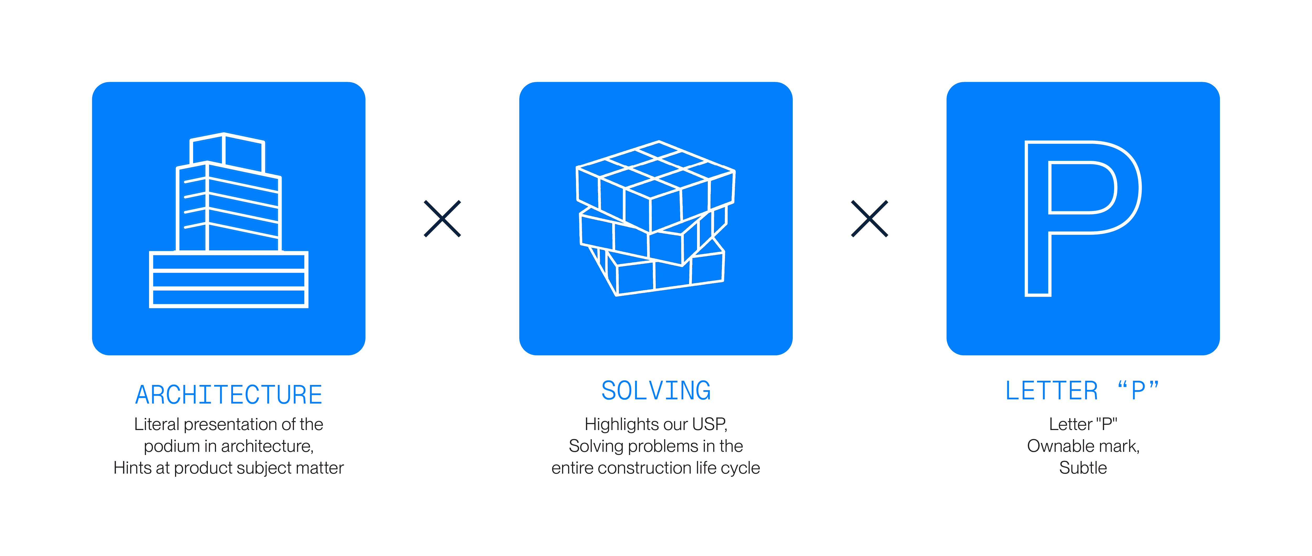
The brand symbol is created to be a proprietary mark that is a combination of all the most crucial parts of the Podium platform. It is paired with a bold typeface that is professional and modern.


Brand Applications
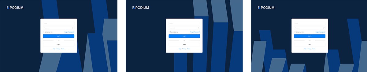
In a fast-paced startup environment, brand elements need to scale quickly and consistently across the multiple touchpoints. To enable this, I used the blue bars derived from the Podium symbol as a flexible secondary graphic system. This device allows the team to extend the brand efficiently across materials. while maintaining strong visual recognisability.
Applied across high-impact touchpoints where first impressions of the brand are formed:
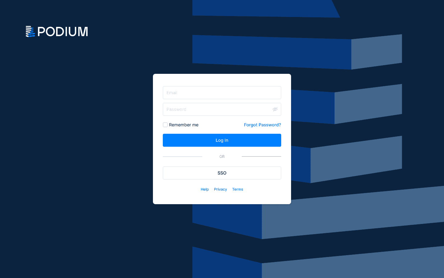
LOG IN PAGE
BACKGROUND CHANGES RANDOMLY AS USERS VISIT
I developed a foldable structure that is portable,
allowing the sales team to move and set up easily during conferences, and allow us to stand out.
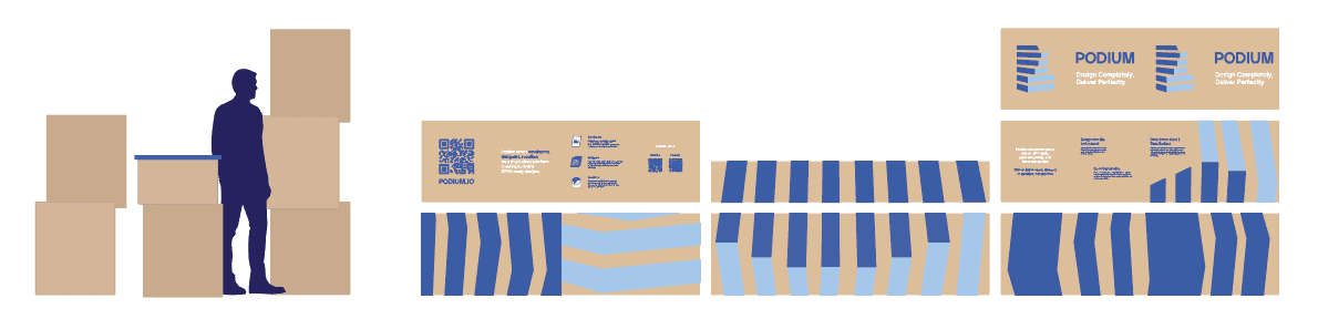
BOOTH STRUCTURE
EARNED US SOME EXTRA PITCH TIME DURING IBEW BUILD 2024
Brand Illustrations
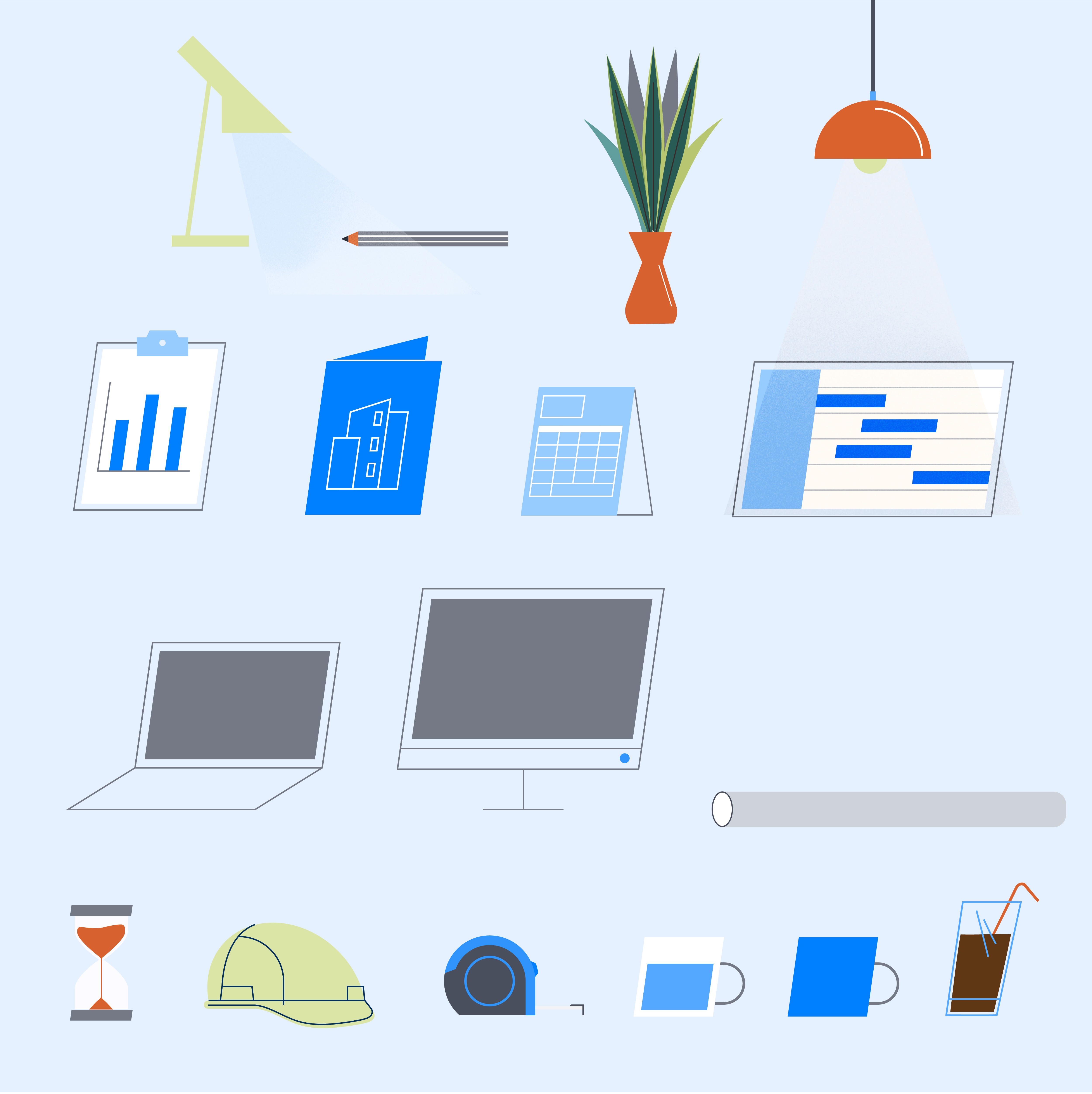
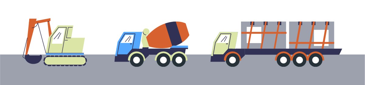
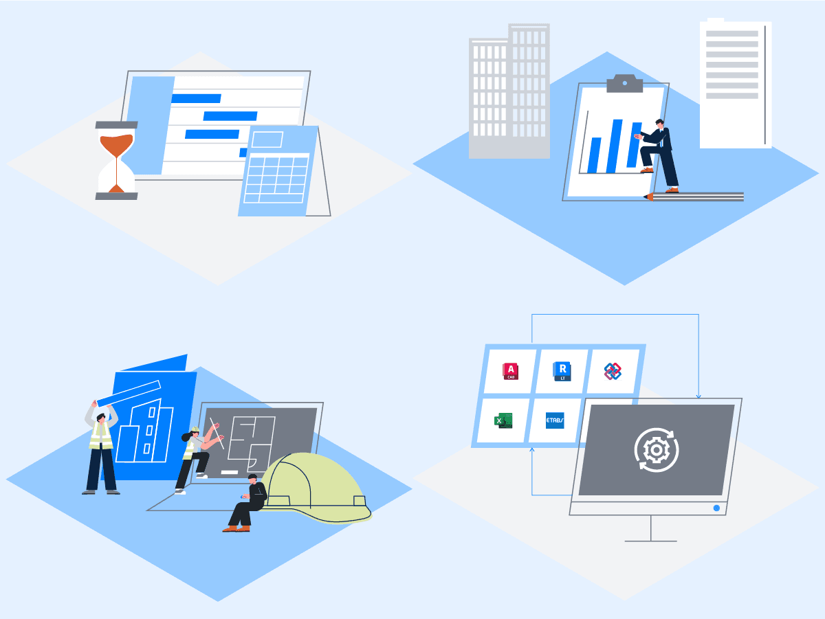
A set of illustrations were developed to help differentiate Podium and make it more approachable. My inspiration came from living spaces – furniture, everyday objects, technology. The idea was to ground the product and brand in something familiar and human. The illustration style was intentionally simple and elements are slightly skewed as a nod to the brand identity.
SERIES OF OBJECTS
PERSONAS

VEHICLES
This was fun to draw :)
Framework & Remixing
An illustrative framework was developed to ensure that the elements can be easily remixed and applied by other designers. Each spot illustration can be easily created by combining different elements. These illustrations are added to the repository, allowing for consistent and efficient application.
Framework: Combination of A, B + C,
put through one of the illustration approaches/ideas:
Group of three
EXAMPLES

Playing with scale
SUPPLIER HEADER IMAGE
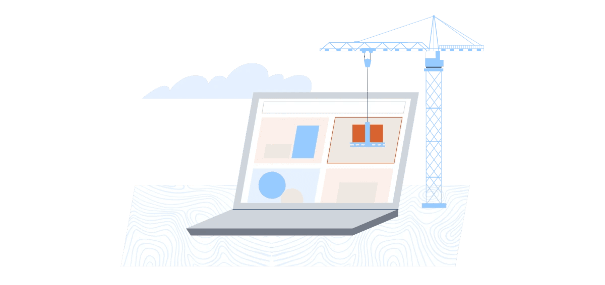
On Applications
On-product illustrations can offer a little delight in the user's journey, and give lightness and a human touch to an otherwise complex and technical product.
INFOGRAPHIC ILLUSTRATION FOR WHITEPAPER
MORE MARKETING MATERIALS
Learnings
Skills learned will always be useful at another time
It's been a while since I took on a branding project and I truly did not expect the first one was post-maternity leave. It was a tight three-day sprint and I am encouraged that the direction resonated with the internal team and was chosen over corporate proposals.
Tangible touchpoints supporting internal alignment
This project reminded me of how branding can strengthen an organisation from within. Seeing colleagues adopt the new identity (like wearing company tees or using stickers) was a small but meaningful signal of alignment. The identity may not be the most critical part of the spin-off, but I like to think it contributed positively.